Drawing CSS icons for fun… and dark mode
In 2022, I offered my help to redesign one of my favorite newsletter: Switch Weekly, curated by Chris Brandrick. As a Nintendo fan, I figured this was perhaps the closest I could ever get to work on a Nintendo related newsletter. This was also a great opportunity to try and experiment new things without a dreadly deadline.
I wanted to add little sparks of fun throughout the newsletter. And I thought about using an icon before the start of the introduction.
![]()
This looked simple and nice enough. Except when you viewed it in dark mode.
![]()
The by default dark icon on a light background now became dark on a dark background, making it almost invisible. Now I could make a second light version of the icon, wrap it in an srcset in a <picture> element bound to a dark mode media query. And I could use data-ogsb attributes to provide additional support in Outlook.com and Outlook mobile apps. But this would end up in a behemoth of code that would still fail in some key clients (hello Gmail apps!). (You can see an example of this technique here.)
So I wondered if this little icon could be drawn in CSS.
CSS Drawings
I’ve always been in awe at CSS drawings. I’m admirative of the cuteness and clever techniques of Lynn Fisher’s A Single Div for example. And I’m frankly mind blown by the work of Diana Smith in her pure CSS art like Francine. But I’ve never found any real use case for these myself.

The techniques involved feel very intimidating to me and almost like a list of things not usually supported by email clients: CSS transforms, CSS gradients, absolute positioning, etc.
But my little newspaper icon was simple enough that I felt I could do it with more basic styles.
Drawing A Newspaper Icon
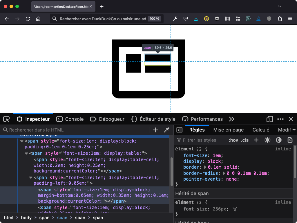
My first attempt consisted in a bunch of nested <span>. I went with <span>s to keep the semantics neutral, all while implying this would be usable as an inline element. I used one <span> for each shape within the icon, eventually grouping two or more in another <span> when it made things easier to layout.

One thing I wanted early on was to make sure the CSS icon could scale to any size depending on the current font-size. So I applied a font-size:1em to every inner element. I then used only em units inside the icon, may it be for width, height, padding or border. So for example, having a border of 0.1em with a current font-size of 20px would make the border 2px large. Increasing the font-size to 40px would automatically scale that border to 4px.
Then I used a mix of basic CSS properties to layout the different shapes within the icon: display, width, height, margin, padding, border and background-color. At this point the entire code for the CSS icon looked like this.
<span style="margin-right:0.2em; font-size:1.25em; display:inline-block; vertical-align:middle;">
  <span style="font-size:1em; display:block; border:0.1em solid #000; border-radius:0 0 0.1em 0.1em;">
    <span style="font-size:1em; display:block; padding:0.1em 0.1em 0.25em;">
      <span style="font-size:1em; display:table;">
        <span style="font-size:1em; display:table-cell; width:0.2em; height:0.25em; background:#000;"></span>
        <span style="font-size:1em; display:table-cell; padding-left:0.05em;">
          <span style="font-size:1em; display:block; margin-bottom:0.05em; width:0.35em; height:0.1em; background:#000;"></span>
          <span style="font-size:1em; display:block; width:0.35em; height:0.1em; background:#000;"></span>
        </span>
      </span>
    </span>
  </span>
</span>
The problem with mixing border (used for the icon’s outer border) and background (used for each individual internal shapes) colors in CSS is that they’re not treated equally when it comes to dark mode. In Outlook.com for example, border colors are always left untouched while text color or background-color are forced to different colors in dark mode.

This is where I thought about using currentColor. This CSS keyword “represents the value of an element’s color property” (according to MDN).
<span style="margin-right:0.2em; font-size:1.25em; display:inline-block; vertical-align:middle;">
  <span style="font-size:1em; display:block; border:0.1em solid currentColor; border-radius:0 0 0.1em 0.1em;">
    <span style="font-size:1em; display:block; padding:0.1em 0.1em 0.25em;">
      <span style="font-size:1em; display:table;">
        <span style="font-size:1em; display:table-cell; width:0.2em; height:0.25em; background:currentColor;"></span>
        <span style="font-size:1em; display:table-cell; padding-left:0.05em;">
          <span style="font-size:1em; display:block; margin-bottom:0.05em; width:0.35em; height:0.1em; background:currentColor;"></span>
          <span style="font-size:1em; display:block; width:0.35em; height:0.1em; background:currentColor;"></span>
        </span>
      </span>
    </span>
  </span>
</span>
But not all email clients support the currentColor, like the desktop webmails of german providers GMX.de and Web.de, or the mobile Android and iOS apps of french provider Orange. Thus leaving a completely blank icon.

Then I remembered that in CSS, using the border property without specifying a color actually acts like using currentColor, thus making the border inherits from the current element text color. In the following example, the two declarations are equivalent.
border: 1px solid;
border: 1px solid currentColor;
So I removed the currentColor from the border declaration from my previous example, and replaced elements with background to use border instead. For example, this rectangle from the example above…
<span style="background:currentColor; font-size:1em; display:block; width:0.35em; height:0.1em;"></span>
…became:
<span style="border-bottom:0.1em solid; font-size:1em; display:block; width:0.35em;"></span>
Here’s the final code for this newspaper icon.
<span style="margin-right:0.2em; font-size:1.25em; display:inline-block; vertical-align:middle;">
  <span style="font-size:1em; display:block; border:0.1em solid; border-radius:0 0 0.1em 0.1em;">
    <span style="font-size:1em; display:block; padding:0.1em 0.1em 0.25em;">
      <span style="font-size:1em; display:table;">
        <span style="font-size:1em; display:table-cell; width:0.2em; border-bottom:0.25em solid;"></span>
        <span style="font-size:1em; display:table-cell; padding-left:0.05em;">
          <span style="font-size:1em; display:block; margin-bottom:0.05em; width:0.35em; border-bottom:0.1em solid;"></span>
          <span style="font-size:1em; display:block; width:0.35em; border-bottom:0.1em solid;"></span>
        </span>
      </span>
    </span>
  </span>
</span>
Afterthoughts
In the end, the icon didn’t make it to the final newsletter as we encountered issues between the tool used by Chris to generate the complete HTML and the platform to send the email.
Does this mean we should do it for every icon? No. First, complex drawings might not always be reproducible as CSS icons with email clients support in mind. Then, the code feels heavy (over ten lines of HTML for a simple icon) and potentially fragile in my opinion, breaking at any email client’s or ESP weird font sizing treatment. And finally, this has literaly zero support in Outlook. There was no need for this in the scope of this project. But I guess we could make the icon in VML, only adding more weights to the email.
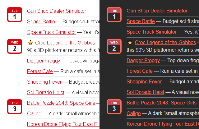
As a conclusion, here are two more “drawings” I did for this email. First, a calendar icon. For this one, I kept using a mix of border and background in order to ease the use of text within the icon. This unfortunately creates a color mismatch between in Outlook.com’s dark mode.

And finally, the footer of the email featured a Switch logo (with the two Joy-Cons). I thought it’d be fun to recreate it in CSS drawing… and to make it interactive using CSS overflow.
You can view the entire email I made back then and view the source code (using a very old version of Maizzle) here. And of course you can subscribe to Switch Weekly! (Who’s excited for the Switch 2? I know I am!)