Fixing Gmail’s dark mode issues with CSS Blend Modes
Since its debut in october 2019, Gmail’s dark mode has been causing a lot of headaches. It has improved and standardized over time, but there are still glaring differences between Gmail’s dark mode in iOS versus Android.
One of the most inconvenient problem in iOS in particular is that Gmail insists on changing any light text color to a dark text color. So an already dark email with white text on a black background will turn black on white. Not only does that seem counter-efficient, but it also creates real accessibility and readibility issues.
Take this email from Nest for example.


I’ve been thinking for a while about how to solve this. And CSS blend modes have been in my mind ever since they’ve been supported in Gmail. So here’s how to fix (some of) Gmail’s dark mode issues with CSS Blend Modes.
1. The base code
For this example, we’ll start by using a single <div> with a black background and white text.
<div style="background:#000; color:#fff;">
    Lorem ipsum dolor, sit amet, consectetur adipisicing elit.
</div>
2. How Gmail transforms colors
If you open an email with the code above in Gmail iOS in dark mode, you’ll see that the colors have been changed. It’s never been clear to me how Gmail actually proceeds to do these color changes. (You still get your original colors if you try to copy and paste the email or if you forward it.) But the end result would be similar to the code below.
<div style="background:#fff; color:#000;">
    Lorem ipsum dolor, sit amet, consectetur adipisicing elit.
</div>
3. Adding blend modes in the mix
Let’s go back to our initial code and let the magic of blend modes begin. We will add two inner <div> containers, each with a black background and a different blending mode.
<div style="background:#000; color:#fff;">
    <div style="background:#000; mix-blend-mode:screen;">
        <div style="background:#000; mix-blend-mode:difference;">
            Lorem ipsum dolor, sit amet, consectetur adipisicing elit.
        </div>
    </div>
</div>
And as our final trick, we’ll use a background image created with a linear-gradient in CSS to maintain our desired background color. (I learnt this hack from Annett Forcier during her dark mode webinar with Anne Tomlin last year.)
<div style="background:#000; background-image:linear-gradient(#000,#000); color:#fff;">
    <div style="background:#000; mix-blend-mode:screen;">
        <div style="background:#000; mix-blend-mode:difference;">
            Lorem ipsum dolor, sit amet, consectetur adipisicing elit.
        </div>
    </div>
</div>
Let’s see step by step how this is processed in Gmail iOS and why this works.
3.1 How Gmail changes this code
First, Gmail will change the colors. White text will turn into black and black backgrounds will turn into white, except for the linear-gradient one. So our code will end up to something like this.
<div style="background:#fff; background-image:linear-gradient(#000,#000); color:#000;">
    <div style="background:#fff; mix-blend-mode:screen;">
        <div style="background:#fff; mix-blend-mode:difference;">
            Lorem ipsum dolor, sit amet, consectetur adipisicing elit.
        </div>
    </div>
</div>
3.2 Blend modes
Let’s talk about blend modes. Per definition:
A blend mode describes how colors should appear when elements overlap.
A blend operation takes a “source color” and blends it with a “backdrop color”. The exact result depends on the type of blend mode we use.
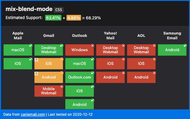
We can use blend modes in Photoshop. And we can use blend modes in CSS thanks to two properties: background-blend-mode and mix-blend-mode. Both are equally supported in Gmail. But because our primary goal here is to maintain text color, we’ll only use mix-blend-mode.
If you want to learn more about blend modes in CSS, I highly recommend to read the following articles:
- Blending Modes in CSS, by Ahmad Shadeed
- Compositing And Blending In CSS, by Sara Soueidan
- Taming Blend Modes:
differenceandexclusion, by Ana Tudor
3.3 The first blend: difference
The first blend that occurs in our code is a difference. By the W3C specification definition, a difference blend mode “subtracts the darker of the two constituent colors from the lighter color”. Mathematically, the result is the absolute value of the difference between our source color (Cs) and our backdrop color (Cb).
B(Cb, Cs) = |Cb - Cs|
If we get back to our code, this blend mode will occur between our black text on a white background (as transformed by Gmail) and its parent white background.
<div style="background:#fff;">
    <div style="background:#fff; mix-blend-mode:difference;">
        Lorem ipsum dolor, sit amet, consectetur adipisicing elit.
    </div>
</div>
Mathematically, this means that our black text from the source becomes…
|Cb - Cs| = |rgb(255,255,255) - rgb(0,0,0)|
          = rgb(255,255,255)
…white! And the white background from that source blended with the white background from the backdrop becomes…
|Cb - Cs| = |rgb(255,255,255) - rgb(255,255,255)|
          = rgb(0,0,0)
…black!
Perfect! But wait, what happens if this applies in Gmail in light mode?
<div style="background:#000;">
    <div style="background:#000; color:#fff; mix-blend-mode:difference;">
        Lorem ipsum dolor, sit amet, consectetur adipisicing elit.
    </div>
</div>
Our white text source blended with the black backdrop becomes…
|Cb - Cs| = |rgb(0,0,0) - rgb(255,255,255)|
          = rgb(255,255,255)
…white! And our black background source blended with the black backdrop becomes…
|Cb - Cs| = |rgb(0,0,0) - rgb(0,0,0)|
          = rgb(0,0,0)
…black! It still works! But wait again, aren’t we done here? If all you need is white text on a black background, you can indeed stop right there. But if you need white text on a colored background, we’re going to need that second blend.
3.4 The second blend: screen
Let’s go back a bit and start again with a white text on a purple background (#639).
<div style="background:#639; background-image:linear-gradient(#639,#639); color:#fff;">
    <div style="background:#000; mix-blend-mode:screen;">
        <div style="background:#000; mix-blend-mode:difference;">
            Lorem ipsum dolor, sit amet, consectetur adipisicing elit.
        </div>
    </div>
</div>
First, Gmail will change those colors. Black becomes white, white becomes black, and the purple becomes a slightly lighter purple.
<div style="background:#c7a4ef; background-image:linear-gradient(#639,#639); color:#000;">
    <div style="background:#fff; mix-blend-mode:screen;">
        <div style="background:#fff; mix-blend-mode:difference;">
            Lorem ipsum dolor, sit amet, consectetur adipisicing elit.
        </div>
    </div>
</div>
Then, the first blend (difference) applies. But at this stage, we’ll get the exact same result as before: a white text on a black background.
Thus enters our second blend: screen. By the W3C specification definition, a screen blend mode “multiplies the complements of the backdrop and source color values, then complements the result”. Yeah, I didn’t get that either. But the maths here helped me to make sense of it.
B(Cb, Cs) = 1 - [(1 - Cb) * (1 - Cs)]
          = Cb + Cs - (Cb * Cs)
So let’s see how this goes. At this stage, it’s just as if we’d blend a white text color on a black background with our purple backdrop.
<div style="background:#639;">
    <div style="background:#000; color:#fff; mix-blend-mode:screen;">
        <div>
            Lorem ipsum dolor, sit amet, consectetur adipisicing elit.
        </div>
    </div>
</div>
Our white text source (Cs) blended with the purple backdrop (Cb) becomes…
B(Cb, Cs) = Cb + Cs - (Cb * Cs)
          = rgb(102, 51, 153) + rgb(255,255,255) - (rgb(102, 51, 153) * rgb(255,255,255))
          = rgb(102, 51, 153) + rgb(255,255,255) - rgb(102, 51, 153)
          = rgb(255,255,255)
…white! And our black background source blended with the purple backdrop becomes…
B(Cb, Cs) = Cb + Cs - (Cb * Cs)
          = rgb(102, 51, 153) + rgb(0,0,0) - (rgb(102, 51, 153) * rgb(0,0,0))
          = rgb(102, 51, 153) + rgb(0,0,0) - rgb(0,0,0)
          = rgb(102, 51, 153)
…purple! And voilà, this is how you maintain a white text on any background color. And this also works with background images.
<div style="background:#6db6b0; background-image:url(https://i.imgur.com/F7S1NGq.jpg); background-size:cover; color:#fff;">
    <div style="background:#000; mix-blend-mode:screen;">
        <div style="background:#000; mix-blend-mode:difference;">
            Lorem ipsum dolor, sit amet, consectetur adipisicing elit.
        </div>
    </div>
</div>
The only problem here is that this code would apply to any email client. And for those that don’t support mix-blend-mode, only the black background would show. We need to make sure that this code only applies in Gmail.
4. Targeting Gmail
The hack to target Gmail has been well known for years (and is referenced on HowToTarget.email). There are two requirements for it to work:
- Have a doctype at the top of your HTML code (ex:
<!DOCTYPE html>) - Add a dedicated class to the
<body>element (ex:<body class="body">)
Then you can target any class name in your code (ex: .foo) with the selector below:
u + .body .foo { }
The reason this works is because Gmail replaces the doctype of an email with a <u></u> element. So the base email code below…
<!DOCTYPE html>
<html lang="en">
<head>
    <title>An HTML email</title>
    <style>u + .body .text { color:green; }</style>
</head>
<body class="body">
    <p class="text">ELO world!</p>
</body>
</html>
…becomes:
<div id=":8p" class="a3s aiL msg4142466614215349360">
    <u></u>
    <div class="m_4142466614215349360body">
        <p class="m_4142466614215349360text">
            ELO world!
        </p>
    </div>
</div>
With the CSS selector also adequatly being prefixed into:
.msg6240499631687324626 u+.m_6240499631687324626body .m_6240499631687324626text { color:green }
So, going back to our code, we will move the two blend mode and background inline styles in a dedicated <style> element. (And we’ll make sure to have a doctype set and a .body class.)
<style>
    u + .body .gmail-blend-screen { background:#000; mix-blend-mode:screen; }
    u + .body .gmail-blend-difference { background:#000; mix-blend-mode:difference; }
</style>
<div style="background:#639; background-image:linear-gradient(#639,#639); color:#fff;">
    <div class="gmail-blend-screen">
        <div class="gmail-blend-difference">
            Lorem ipsum dolor, sit amet, consectetur adipisicing elit.
        </div>
    </div>
</div>
An unexpected but welcome side effect of separating the blend styles like this is that it gracefully falls back in the Gmail Apps with Non Google Accounts. In GANGA (as email geeks like to call it), mix-blend-mode is not supported. But neither are <style> elements. So in that case, Gmail will just apply its regular color adjustment.
5. Final code
Here’s a full code example with everything up in place.
<!DOCTYPE html>
<html lang="en">
<head>
    <meta charset="UTF-8">
    <meta name="viewport" content="width=device-width, initial-scale=1.0">
    <title>Fixing Gmail’s dark mode issues with CSS Blend Modes</title>
    <style>
        u + .body .gmail-blend-screen { background:#000; mix-blend-mode:screen; }
        u + .body .gmail-blend-difference { background:#000; mix-blend-mode:difference; }
    </style>
</head>
<body class="body">
    <div style="background:#639; background-image:linear-gradient(#639,#639); color:#fff;">
        <div class="gmail-blend-screen">
            <div class="gmail-blend-difference">
                <!-- Your content starts here -->
                Lorem ipsum dolor, sit amet, consectetur adipisicing elit.
                <!-- Your content ends here -->
            </div>
        </div>
    </div>
</body>
</html>
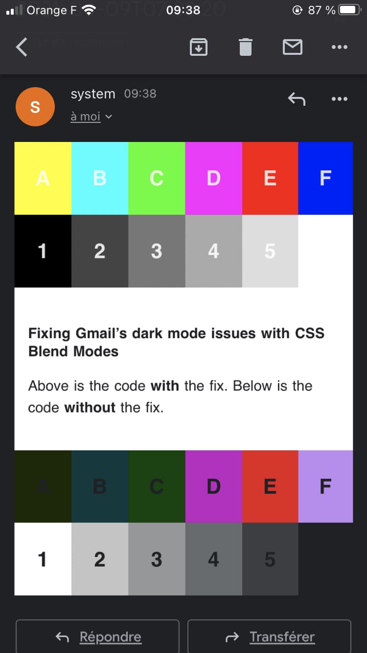
I also made a sort of test card email to try out different background colors. You can find the code here.

Conclusion
I believe dark mode can be a major advancement in accessibility and user preference. And as I stated two years ago, “the best you can do is to embrace this choice instead to try and go against it”. But it’s also important to acknowledge when email clients mess up.
I’m super excited to have come with this solution. And while it’s still limited (the blending limits it to white text only), I hope it’ll be of good help to anyone struggling with Gmail’s dark mode.
