Email Coding Guidelines
Where I share my coding principles for HTML emails.
Last week I attended the EMday conference near Paris and shared some of my best practices for coding HTML emails. I wrote a full document and it’s available on GitHub for anyone to share, contribute and adapt to your own needs. This is heavily inspired by some popular web coding guidelines, like @mdo’s Code Guide and Stack Overflow’s Email Design Best Practices.
The goal of this document is to establish principles that anyone can apply to code modern, well supported and accessible HTML emails. This is the result of some of my work from the past few years where I gave email coding trainings and I spent a lot of time helping other email developers on Slack, Twitter or forums.
Here are three of the (now) nine points long document.
Use the HTML5 doctype
The HTML5 doctype is clean, short and easy to remember. It’s used by a vast majority of email clients, so your code will inherit it anyway. Just be aware that some other email clients might use other doctypes and your email might end up being rendered in Quirks Mode. (See also: Which doctype should you use in HTML emails?)
<!-- Good example -->
<!DOCTYPE html>
<html>
  <head></head>
  <body></body>
</html>
Make it work without <style>
Not every email clients support <style> tags. <style> tags filtering can be:
-
Permanent. For example, the Gmail Apps (on iOS and Android) with Non Gmail Accounts (also known as GANGA) don’t support
<style>tags. This also happens on a lot of international email clients like Libero (in Italy), Mail.ru or Yandex (in Russia), Nate or Naver (in Korea), T‑online (in Germany), Telstra (in Australia) or Terra (in Brazil). -
Temporary. In the past year, Gmail removed
<style>tags for a day at least two times (on 2019/04/23 and on 2018/07/13). -
Contextual. When you forward an email in the desktop webmail of Gmail, all
<style>tags are removed. Gmail is also known for removing<style>tags when an email is viewed in its unclipped version. (See also: Gmail removes<style>tags in non clipped view.) -
Buggy. The Yahoo app on Android removes
<style>tags inside the first<head>of your page. (See also: Yahoo! Mail app for Android strips styles from the first<head>tag.)
“Making an email work” without <style> can mean a lot of different things. But I think first and foremost about:
-
Layout. An email without
<style>should adjust to any width without horizontal scroll. I usually consider to go as low as 280px wide which reflects the width an email viewed on Gmail on an iPhone SE. -
Branding. An email without
<style>should reflect the branding of the sender.
Don’t split visuals
Avoid splitting an image into multiple files. This is important for several reasons:
- Performance. Just like on the Web, The fewer HTTP requests the better. Downloading a single 50 Kb image is theoretically faster than downloading five 10 Kb images.
-
Accessibility. A single image will let you define a single clean
alttext, and style it in case images aren’t visible. -
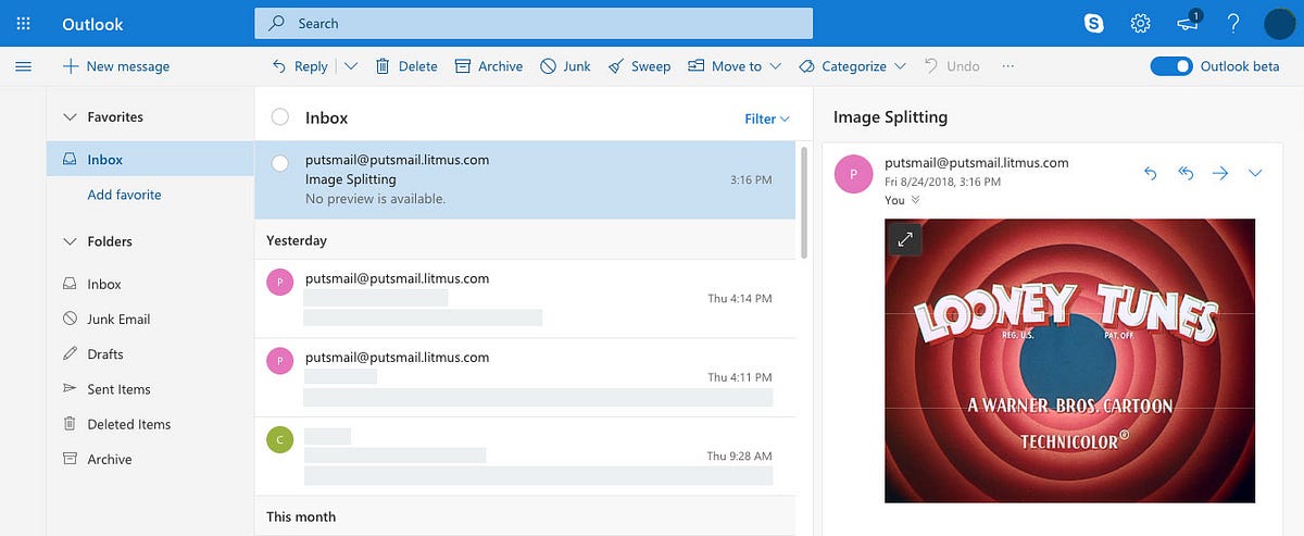
WebKit adds small thin lines between images when using a CSS
transformon a whole email. This is something used by numerous email clients to adjust the rendering of non responsive emails on smaller screens.
The current beta of Outlook.com uses a CSS transform to adjust the display of an email within its preview pane. On Chrome or Safari, this can result in thin lines between split images like in this example. -
Because shit happens. Email clients or user preferences may change how your email look. You don’t want this to happen:

Image splitting gone wrong on a LinkedIn email. (Found under “She must be Canadian.” on Reddit.)
Want to learn more? Here are some of the topics addressed in the rest of the document:
- The
langattribute - Semantic text markup
- Tables for layout
- Styles over attributes
- Use
marginorpaddingfor spacing - Support Outlook at 120dpi
Head over to GitHub for the full Email Coding Guidelines document. It’s also available in french, and translations contribution are welcome!