The Fab Four Technique to create Responsive Emails without Media Queries
I think I found a new way to create responsive emails, without media queries. The solution involves the CSS calc() function and the three
width, min-width and max-width properties.
Or as I like to call them all together: the Fab Four (in CSS).

The problem
Making responsive emails is hard, especially since email clients on mobile (like Gmail, Yahoo or Outlook.com) don’t support media queries. An hybrid approach, a Gmail first strategy, or a responsive email without media queries are great ways to adapt to this situation.
That last approach has been my favorite so far. The big idea is to have columns as <div>s with a fixed width aligned with “
display:inline-block. Once a screen can no longer contain two blocks side by side, they will naturally flow below each other. But I’ve always had a problem with this.
Once all the blocks are stacked, they don’t take the full width of the email.
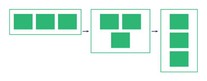
I’ve been looking for ways to solve this problem for a long time. Flexbox is a great contender, but unfortunately Flexbox support in an email is abysmal.
A solution
Remembering width, min-width and max-width
On top of the calc() function, the solution I found involves these three CSS properties. In order to fully understand how it works, here’s a reminder of how
width, min-width and max-width behave when used together (as
clearly summarized by fellow french front-end developer Raphaël Goetter).
-
If the
widthvalue is greater than themax-widthvalue,max-widthwins. -
If the
min-widthvalue is greater than thewidthormax-widthvalues,min-widthwins.
Can guess what the width of a box with the following styles would be ?
.box {
    width:320px;
    min-width:480px;
    max-width:160px;
}
(Answer : the box would be 480px wide.)
Introducing calc() and the magic formula
Without further ado, here is an example of the Fab Four to create two columns that will stack and grow below 480px.
.block {
    display:inline-block;
    min-width:50%;
    max-width:100%;
    width:calc((480px — 100%) * 480);
}
Let’s break it down for each width property.
min-width:50%;
The min-width property defines our column widths on what we could call our desktop version. We can change this value to add more columns (for example, 25% for a four columns
layout), or set columns with fixed pixel widths.
max-width:100%;
The max-width property defines our column widths on what we could call our mobile version. At 100%, each column will grow and adapt to the full width of their parent container. We can change this value to keep columns on mobile (for example, 50% for a two columns layout).
width:calc((480px — 100%) * 480);
Thanks to the calc() function, the width property is where the magic happens. The 480 value matches our desired breakpoint value. The 100% corresponds to the width of the parent container of our columns. The goal of this calculation is to create a value bigger than our max-width or smaller than our min-width, so that either one of those property is applied instead.
Here are two examples.

With a parent of 500px, the calculated width equals -9600px. It is smaller than the min-width. So the min-width of 50% wins. Thus we have a two columns layout.

With a parent of 400px, the calculated width equals 38400px. It is bigger than the min-width, but max-width is smaller. So the max-width of 100% wins. Thus we have a one column layout.
Demo
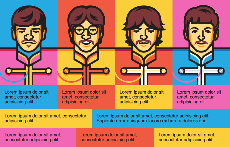
Here is a demo of what this technique can do.
You can see the full demo online here (or on Litmus Builder or on CodePen).
And here are two screenshots of this demo in Gmail, on the desktop webmail and on the mobile app on iOS. Same code, different render.
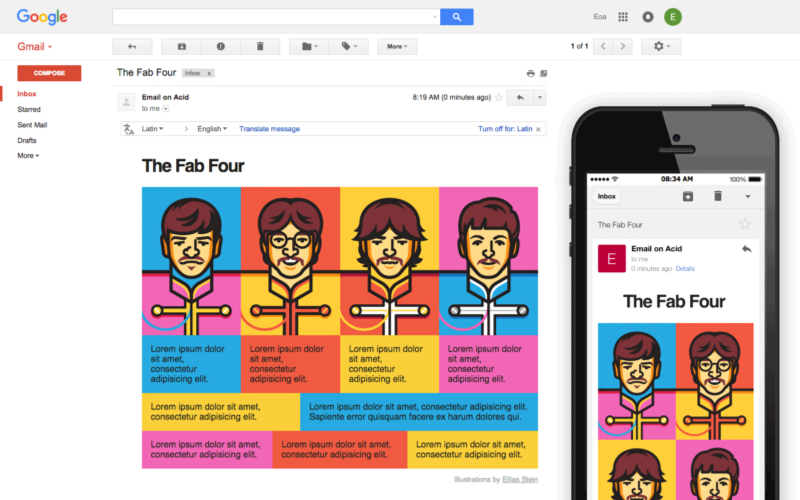
In this demo, I’ve set a few examples of different grids (with two, three, four columns). The first grid, with the images, is built to go from four columns on desktop to two columns on mobile. The other grids are built to grow full width on mobile.
Also, notice how the title switches from a left aligned position on desktop to a centered position on mobile. This is achieved by giving the title a fixed width of 190px and a margin:0 auto; to center it. On desktop, the title’s parent container has a min-width of 190px applied, so the logo stays on the left. On mobile, the parent container grows full width, so the logo becomes centered.
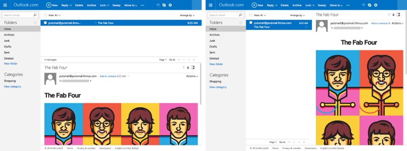
A great aspect of this technique is that, since everything is based on the grid’s parent width, an email can adapt even on a desktop webmail. For example, on Outlook.com, no matter if you chose to have the reading pane on the bottom or on the right, the email will correctly responds to the reading pane’s width. This would be impossible to do with media queries.
Support
In browsers, calc() is well supported since IE9. Turns out, calc() also has a pretty good support in email clients. It works in Apple Mail (on iOS and OS X), Thunderbird, Outlook (iOS and Android apps), Gmail (webmail, iOS and Android apps), AOL (webmail), and the old Outlook.com (still present in Europe).
The old Outlook.com
Outlook.com has one small quirk, though. The webmail will filter every property with a calc() that includes any parenthesis. This means that calc(480px - 100%) is supported, but calc((480px - 100%) * 480) is not. Since my initial formula involves parenthesis, we need to refactor it to avoid parenthesis. So the formula to support the old Outlook.com looks like this.
width:calc(480px * 480 — 100% * 480);Unsupported clients
Of course, calc() isn’t supported in old email clients like Lotus Notes, or the latest Outlook for Windows (using Word’s HTML rendering engine). It also won’t work on Outlook Web App (both Office 365 and the new Outlook.com) and Yahoo (webmail, iOS and Android apps). These two will strip out any property involving a calc().
Fallbacks
In these cases, I would suggest duplicating all involved properties with fixed width values for clients that don’t support calc(). In order to hide The Fab Four from those clients, I advise to use calc() functions, even if it’s not technically useful. Our first example would look like the following.
.block {
    display:inline-block;
    min-width:240px;
    width:50%;
    max-width:100%;
    min-width:calc(50%);
    width:calc(480px * 480 — 100% * 480);
}
Outlook Web App
However, Outlook Web App (both Office 365 and the new Outlook.com) has one more quirk of its own. When a calc() function contains a multiplication (with the * character), the new Outlook.com and Office 365 will remove the whole inline style attribute corresponding. This means we need to calculate the multiplications by hand and only keep the resulting substraction. Here’s what the final calculation looks like for a 480px breakpoint.
width:calc(230400px — 48000%);WebKit Prefixes
Older versions of Android (before Android 5.0) or iOS (before iOS 7) require -webkit- prefixes in order to work. Our final version looks like the following.
.block {
    display:inline-block;
    min-width:240px;
    width:50%;
    max-width:100%;
    min-width:-webkit-calc(50%);
    min-width:calc(50%);
    width:-webkit-calc(230400px — 48000%);
    width:calc(230400px — 48000%);
}
Shortcomings and final thoughts
Like anything in the email development world, the Fab Four technique isn’t perfect. Here are a few limitations that I can think of:
- It won’t work on Yahoo. The desktop version of its webmail supports media queries, though. So we could improve things a bit by making a mobile first version of our email, and then enhancing it on desktop with media queries.
- You can only set one breakpoint. This might not be such a problem for emails though, as designs rarely go beyond 600px on desktop and don’t require more than one breakpoint to adapt on mobile.
- You can only diminish the number of columns from a desktop version to a mobile version. While this rarely happens, you couldn’t go from a four columns layout on mobile to a single column layout on desktop.
- The final version of the calculation (to support the old Outlook.com and degrade gracefully on the new one) is hard to read. Using a preprocessor and a mixin to generate all the required properties could be more than helpful.
I still think that this technique will come in very handy in a lot of cases, especially for Gmail optimizations. I’m sure there is also use cases for websites (like widgets, ads, …).
And I can’t wait to see what this will inspire you to create.