Do emails need to look exactly the same in every client?
No.

Oh, you’re still there ? So maybe I should elaborate a bit more.
Two years ago, a client asked me to build the following for an email. It’s an image with a text over it. The image can vary on width and height. The text is dynamic and has to be in HTML, and it has a print like effect with a background color. And the whole thing needs to be clickable and optimized on mobile.
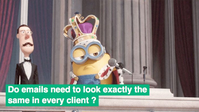
Let’s be clear : there’s no way to build this for an email that would match all the above constraints and work in the most popular email clients like Outlook 2016, Gmail or Outlook.com. This particular example requires the use of CSS properties like box-shadow, box-decoration-break, absolute positioning, and media queries.
But using progressive enhancement, I was able to build this in a consistent way so that it still looks good in most email clients. You can view the full code on CodePen or on Litmus Builder. And here are some examples.
Tests results
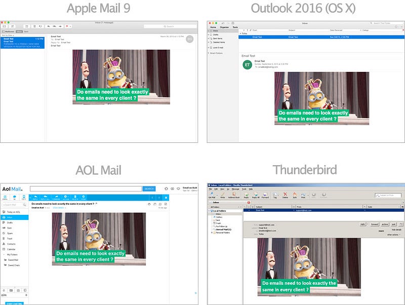
On clients that provide full support for all the CSS used, the email shows as expected. This includes Apple Mail (on OS X or iOS), Outlook (on OS X), AOL Mail, and Thunderbird.
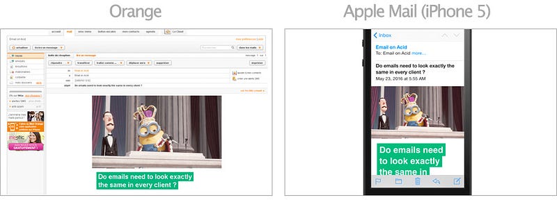
On clients that support box-shadowbut not absolute positioning (like for example french ISP Orange’s webmail), or clients on a smaller screen (like Apple Mail on an iPhone 5), the text still has its print like effect, but is placed below the image.
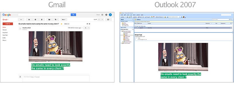
On clients that support neither box-shadow nor absolute positioning (like Gmail, Outlook.com, Yahoo or the Outlook 2007–2016), the print like effect around the text will be missing. But thanks to a background-color defined in CSS, the text is still fully readable.
Afterword
This is not perfect. This is not ideal. I wish more email clients had better CSS support. But if I rejected my client’s design because I couldn’t build it the same way everywhere, there’s a good chance he would have designed something similar to the render obtained in clients that support less CSS. So why not improve the render for clients that do support advanced CSS ?
In the email development world, there is no such thing as conforming to the lowest common denominator, unless you want to send plain text emails for the rest of your life.
Other examples
This approach to design email is certainly not new, and there are tons of emails out there that already embrace progressive enhancement and graceful degradation. Here are three of my favorites.
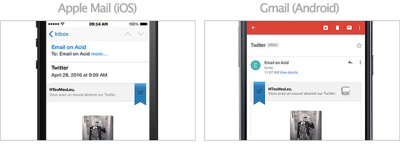
When you have a new follower, Twitter sends you an email notification. The header of this email is composed of a blue ribbon with Twitter’s logo and the title of the email. In most email clients, the ribbon is on the left (like on Gmail on Android). But on smaller screens, and on clients that do support media queries (like Apple Mail on iOS), the ribbon is moved to the right. I believe this helps provide a better reading experience on mobile.
Code School
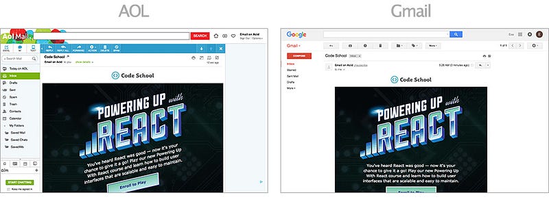
Last month, Code School launched a new React course. Their announcement newsletter uses CSS transforms to skew and rotate the text just like in their title image. (Kudos to Kevin Mandeville for sharing this one.) This doesn’t work everywhere. But it degrades gracefully for other email clients. And it’s a fun detail that can help get noticed in the inbox.
Taco Bell
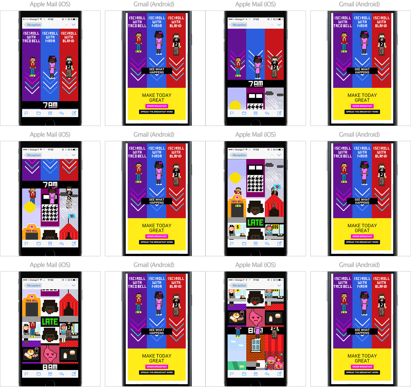
Interactive emails are a great example of how emails can not only look different on different clients, but also can behave differently. Recently, the eRoi Team created an email with a scrolling experience for Taco Bell. For unsupported clients (like Gmail on Android), a “See what happens” button appears, redirecting to the mirror page. But for supported clients (like Apple Mail on iOS), you do have a different experience !
Conclusion
Websites like dowebsitesneedtolookexactlythesameineverybrowser.com and dowebsitesneedtobeexperiencedexactlythesameineverybrowser.com have been around for almost a decade. It’s about time we embrace the fact that emails are never going to look the same in every client.
Images will be blocked. Styles will be filtered. Tables will be munged. Instead of struggling to try to make emails look the same everywhere, let’s embrace their differences.